Chris Andrews, April 2008
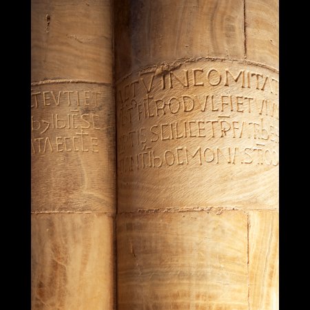
Earlier this week I helped out David Ward and Anna Booth at their joint exhibition at the Oxo Gallery. While there I was able to pick up my copy of David's second book, Landscape Beyond, which explores the fundamental beliefs that underpin his photography. One of these is simplicity, and he tells the story of a photo critique session where a picture of some stone columns exemplified simplicity. Well, I can reveal that the picture concerned was this one - Column Inscriptions, Sant'Antimo Abbey, Tuscany, May 2007 - which I took on the 2007 Light & Land tour to Tuscany led by Phil Malpas and Clive Minnitt.
As mentioned in the text, one of the group did not understand why this picture was well received. I can see why this could be: there are no obvious hooks within the picture like a grand vista or a spectacular sunset, and it appears to be a picture that anyone could take. It is also not a record of the abbey itself. Indeed, the other image I made there at the time, which shows a wider view of the abbey, evokes my memories of being there more than this one does (although the other picture is technically flawed). So why does this image work? Simplicity is part of it, as is a sense of mystery (another of David's themes).
I was first struck by the quality of the light illuminating the interior. The harsh midday sun was bouncing off the stone walls of the abbey, giving a warm glow to the marble which is normally a pinky grey colour. The light falling on these columns was particularly appealing as the play of light and shadow helped to define the curved surface. The inscriptions also fascinated me as they seem to speak of distant times. Who knows who else has been past these columns over the centuries? Selecting the framing took 10 to 15 minutes of thinking. How much of each column do I include? Do you need to be able to see all of the text? How much of the column do you show above and below the text? Portrait or landscape format? How close to the edge of the columns do you go? This is where the precise control of the 5×4 camera and the Manfrotto 410 head come into their own as subtle tweaks are easy to achieve and you can see the results on the ground glass screen. The inscriptions are also 2m or so above ground level, so I needed to use rising front to ensure that the verticals remained vertical. Film choice was Provia 100F, which recorded the subtle colours and handled the long exposure (30 seconds) without any reciprocity failure. To add to the mystery, when I got the film developed I noticed that there is some 18th century graffiti on the right hand column. There is a flowery signature just below the Latin inscription, which makes you wonder about who that person was, why were they there and what made them do it? We may never know.
So the end result is a deceptively simple image. It's one of those where a lot of people think they could just turn up with their camera and get something similar, but is actually very tricky to get right.
One of the comments during the critique was that "you wouldn't hang it on your wall...". I'm pleased to say a version of this does indeed hang on the wall in my flat.